Freelance Work
Brand identity and editorial design for independent clients

Overview
I started taking on freelance work in 2022 while preparing for my move to Canada, a way to stay sharp and keep designing through the transition. That continued through my studies at BCIT's Digital Design and Development diploma program, and it's something I've carried forward. I still take on freelance projects today while working as a Workplace Coordinator at Autodesk.
Ube Books and BTY Group are two highlights from that body of work. Different in scope and industry, but both built from scratch and delivered independently. They're samples of what I've worked on; the range also covers digital assets, marketing collateral, and additional branding projects across a mix of clients.
Ube Books — Brand Identity
Ube Books is a passion project belonging to a friend of mine, a Filipino nurse based in the United States. Her advocacy is a series of children's books that celebrates the Filipino nursing community and Filipino food, culture, language, and values.
For the brand, she wanted the colours of the Philippine flag worked into the identity, but with purple as the lead. Purple is her favourite colour, and it's also the colour of ube, the beloved Filipino root crop the brand is named after. The palette was built around that: purple as the foundation, with the flag's blue, red, and gold brought in as supporting tones.
The logo uses a stack of books as the visual anchor, with the spines forming part of the wordmark. The full system includes horizontal, stacked, and icon-only lockups, all tested across the full range of brand backgrounds.
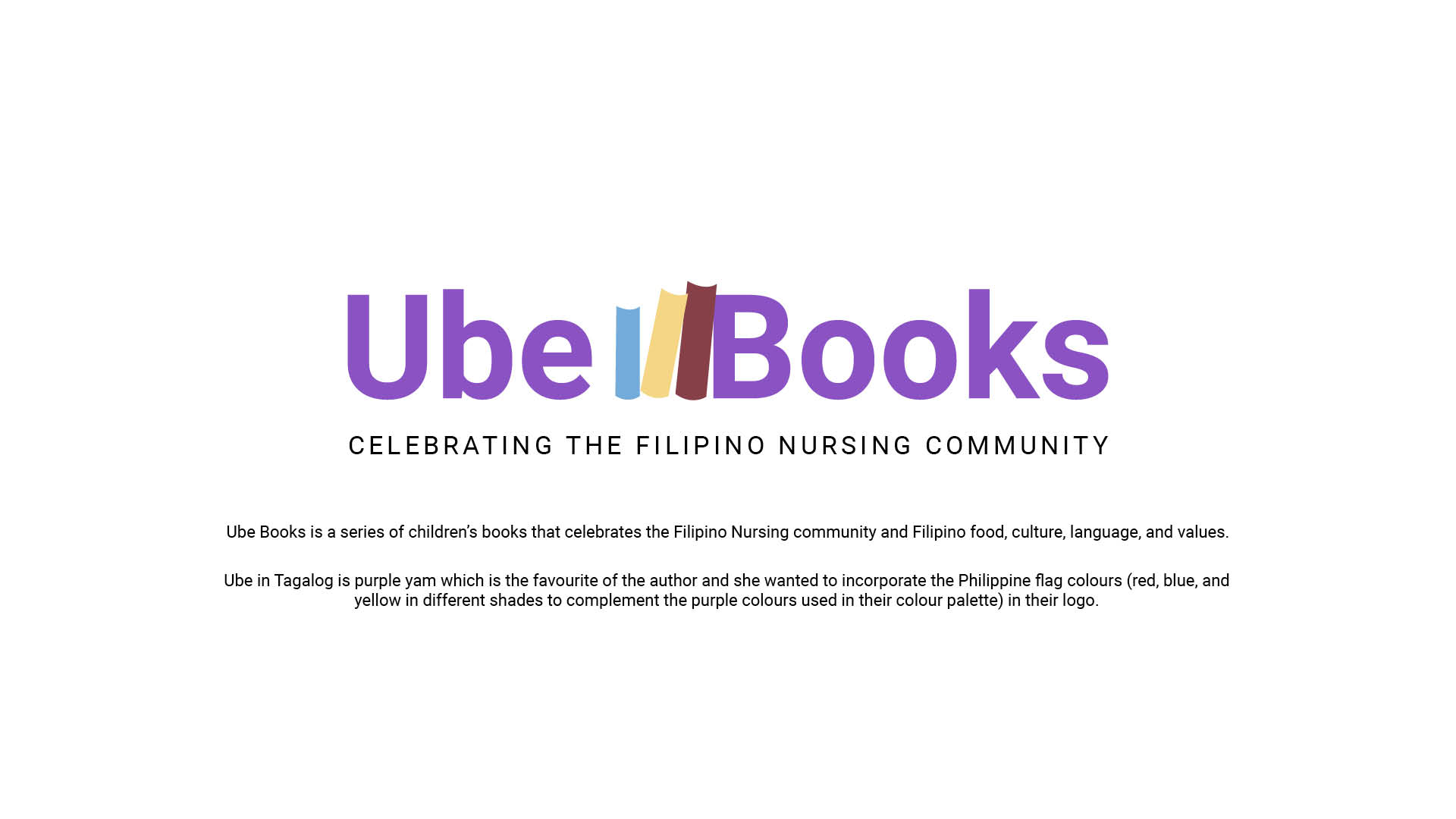
Brand overview — Ube Books, celebrating the Filipino nursing community.
BTY Group — Financial Report Design
BTY Group is a construction and real estate consultancy operating across Canada, the US, the UK, and Ireland. Their financial reports were data-heavy and difficult to present. The brief was to make that data easier to read and understand without overwhelming the people it was being presented to.
My approach with freelance clients is to present two design directions and let them decide where to take it. For BTY, both directions worked within the existing brand colours of black, yellow, and teal, but approached the layout and hierarchy differently. Direction B was chosen, and that direction was then applied across the full report.
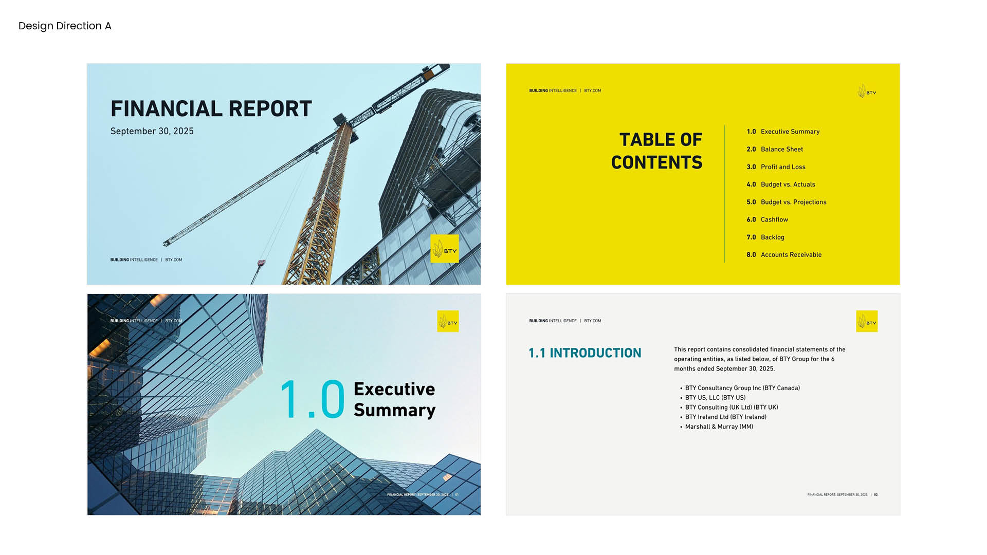
Direction A — cover, table of contents, and executive summary section openers.